Tuesday, December 16, 2014
Monday, December 1, 2014
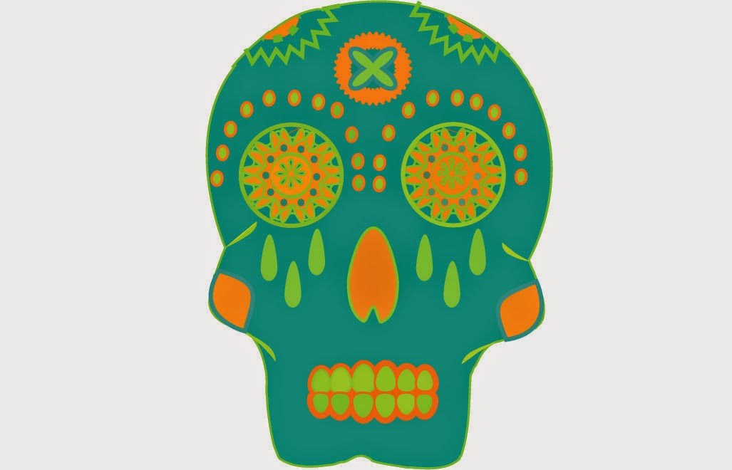
Logo Design History Writing Assignment: Superman Logo
History of Superman Logo
Superman is the iconic super hero character made by Golden Age Comics in 1938. No one can forget the famous Superman logo, but most people have no idea where the comic got it’s logo from. As simple and classic as the logo is, it actually has a lot of history behind it. There has been 25 different logos in the last 75 years! 
Superman was the first super hero ever created and coined the idea of having a symbol for his character. Every other super hero comic made has used Superman as a foundation for their ideas. Without Superman, no other super heros would have a logo to represent themselves, without Superman there wouldn’t even be any super heros! But how did the creators of Superman come up with the design for the characters logo?
In 1945, National Periodical Publications (later simply known as "DC Comics") trademarked Superman's symbol. The Superman S symbol was inspired by a Natibe American woman’s blanket. each of the five sides of the diamond shield represents the five Iroquois Indian tribes that remained, and the "S" was a snake, considered to be a symbol of healing. Before they created the symbol, they did go through a lot of changes in Superman’s “look” and covers for all the comics.
Before After


Even though the new Superman comics are much more detailed and require much more work and money, Superman’s actual costume and physique hasn’t changed much. He still has the classic red cape and blue body suit, and he still has the big S symbol on his chest, but the logo has gone through some changes.
Surprisingly, everyone of the Superman logos have fit into the 5 characteristics we studied in class. They’re all very recognizable, the symbol is arguably one of the most famous logos ever. Not to mention, it’s also effective without color, it’s scalable, and it is also very easy to describe.

Tuesday, November 25, 2014
Logo, Branding and Identities: Notes Part 3
Design Styles
- Typeface Focused:This style relies on a type face to create the logo design, creativity is utilized in the proximity, contrast, color, customization of the letter forms.
- Mixing Typefaces: This style uses 2 different typefaces to create the logo design. Strive to create a balanced design, typefaces that are too similar will lack contrast in style.
- Typeface Plus Graphic Element:This style uses simple graphic elements in addition to the type face to create an emphasized and balanced design. Graphic elements remain abstract
- Typeface Plus Shapes/Symbols: An even balance between art and typography is achieved in this style.
- Graphic Focused Design: In this design the graphic elements are the focus or dominant aspect of the design, the typeface plays a supporting role.
Logo, Branding and Identity: Notes Part 2
Why do we use Vector Art?
- We create logos as vertor art because it's flexible, powerful and easily edited, this is important when clients want to make changes.
- Vector art can be scaled up infinitely without losing quality!
Pencil to Vector
- Creating a logo design requires many phases.
- Many meetings and review sessions are required to arrive at adesign that works.
- Converting a simple pencil sketch or vector art requires establishing graphic style, color, line shape and typography.
Final Art: Graphic Style
- Decide what your design style will be
- Will it be bold, simple and cute?
- Will it be sleek, technical and sedate?
- Will it be high tech and 3D?
- There is a wide range of styles to choose.
- Choose what fits your concept and market.
Final Art: Line Quality and Shape
- Line quality: refers to the smoothness and precise nature of your lines.
- We use the Pen Tool to create perfect smooth lines.
- Line shape: If you have line art in your logo your line shape is important.
- Do you want an artistic look to your line? Try a custom "Art Brush" from the brush Library in IA
Color Matters!
- Color makes a huge difference, use colors that are appropriate for your design.
Logo Design: General Rules and Styles for Designing Logo's
- Don't pull a "GAP"!
- Describable?
- Effective without color?
- Memorable?
- Scalable?
Logo, Branding and Identity: Notes
November 25
Logo, Branding and Identity
Developing an understanding of branding framework
- Brand is the "perceived" emotional corporate image as a whole, it is the reputation both claimed and perceived
What is Branding?
- An organizations brand or branding is essentially their public image.
- A designer can create the framework for a brand, colors, fonts, artwork, style... but the audience completes the brand through an emotional reaction with it.
- Branding example: Apple is an IT company that projects a humanists image, positive corporate ethics, and support of good causes.
- When people use the products they connect to the brand emotionally.
- Corporate identity is comprised of the visual aspects that form the brand.
- Close attention is paid to executing a consistant experience for the viewer.
What is Identity Design?
- The corporate identity includes strict usage of colors, font families, graphic elements and other guidelines, usually detailed in a corporate identity guide.
- The identity can include the logo, logo variations, business cards, labels, envelopes, letterhead stationary, advertisements, tv commercials, packaging and etc...
What is a logo?
- A logo is for identification.
- A lgo is the simplest way a company or organizations can represent itself, through the use of a symbol or icon.
Summary
- Brand- The perceived emotional corporate image as a whole.
- Identity- The visual aspects that form part of the overall brand.
- Logo- Identifies a business in its simplest form via the use of a mark or icon.
Monday, November 24, 2014

Friday, November 7, 2014

Tuesday, November 4, 2014
ROP Career Skill Notes: Resume Part 2
Resume Writing Tips
- Go with what you got: summer jobs, volunteer experience, clubs, relevant hobbies
- Dont have a degree or diploma? State your estimated date for completion, (Class of 2017)
- Just keep it professional, well organized and easy to read
- Never put photo on your resume
- Contains tips and guides for all aspects of your portfolio
- Has 2 sample reumes
- Find a program to write your resume with such as Word, Google Docs, or Pages
- Think of your ideal job might be this summer or in the future, align your resume info and objectives to that job
- Use the Resume Templet
ROP Career Skill Notes: Resume
11/4/14
Career Skill Notes
(How to write a great resume)
Your ROP Portfolio
- A portfolio containing three or more of your best work samples and a written explanation of each example
- Letter of introduction
- Resume
- List of references
- Letter of recommendation
- A solid well written and well designed resume
- An equally well crafted list of positive references
- A flawless handwritten job application
- Who you are and how you can be contacted
- Your job objective
- Your level of education
- Your work history or experience
- Your special skills and abilities
Edit and Refine Your Resume
- Take time to write your resume
- No typos, use spellchecker
- No mistakes, look for double words, grammar errors
- No misleading information
- Format your text for easy reading and searching
- List most recent job experience first
- List most important skills first
- Leave out obvious
- Avoid negativity
Thursday, October 30, 2014

Wednesday, October 29, 2014

Thursday, October 23, 2014

Friday, October 10, 2014
Thursday, October 9, 2014
Typographic Notes
Typography
Fonts are the clothing that our ideas wear.
Serif vs Sans Serif
- Serif reads better at smallest sizes, can be complimentary.
- Always make writing easiest to read for the reader.
- Font Variance, Too many fonts confuse the reader(Don't go crazy;D).Definition, Fonts that are too similar because ambiguity.Caps, Use upper and lower case letter for optimum clarity.(Difficult to read and seems like shouting, only use in appropriate times.Alignment, Left alignment reads easiest, consider eye flow as it moves down a page.Emphasis, Use these tools with discretion and without disturbing eye flow.Integrity,Avoid stretching or distorting type.Weight, strive for sense of balance.
The Mac is Not a Typewriter
- Kerning is the way spacing is done.It's the individual spacing of letters
- Tracking is the spacing that's applied to whole groups of layers.
- Large Text Blogs:Rags,Strive for more consistant spacing.Want text layout to look more uniform.
Friday, October 3, 2014


Tuesday, September 30, 2014
COLOR THEORY PART 2
Color Harmony
- Different complements/harmonies ->
- Analogous
- Split
- Triad
- Tetradic
- Quadrilateral
Color Palettes
- Different color palettes can invoke mood, location and emotion. For example (Pop Art, Russian Poster Art, Metal, Earth, Beach, Flowers, Fruit, Vegetables.
- Color Properties (Cool, Warm, Bright, Dark, Saturated, Desaturated.)
- Color Intensity: Intensity changes in relation to its surrounding color.
Color Associations
- These types of color associations are universal to all people
Why color matters
- 73% of purchasing decisions are now made in store
- Color also increases brand recognition by up to 80%
Color Affects
- Appetite: Blue is rare occurrence in nature.
- We have no appetite response to blue food.
- Mind: Pink is a tranquilizing color that drains your energy.
- Used prisons, holding cells, opposing team locker rooms.
- Optimism: Yellow, Friendly: Orange, Excitement: Red, Creative: Purple, Trust: Blue, Green: Peaceful
COLOR THEORY NOTES
Color Theory Notes
Color
- Primary, Secondary, Tertiary.
- Colors: Used to catch the eye, and to manipulate you.
- ROYGBIV: Red Orange Yellow Green Blue Indigo Violet =Rainbow
- Primary Colors= (Red, yellow, and blue.) Pigment generated colors are derived from, these primary colors. Or (Red, blue and green) Light generated colors are derived from these primary colors.
- Secondary= Mixing primary colors creates other colors. For example: Blue + Yellow=Green Blue + Red= Violet
- Dark color recedes and light color advances
- Rgb Red, green, blue. Light generated model.
- Rby Red, blue, yellow. Pigment generated model.
- CMYK Cyan, magenta, yellow, black. Print process model.
- Monochrome Tints, shades and tones of a single tone.
- Grey Scale, black and white only.
- Web Safe RGB, hexadecimal compatible.
Tints, Shades, Tones
- Tints= add white to a pure hue.
- Shades= Add black to a pure hue.
- Tones= Add grey to a pure hue.
Color Harmony
- Complementary Colors: Colors across from each other on the color wheel.
Friday, September 26, 2014

Thursday, September 25, 2014

Tuesday, September 23, 2014

Thursday, September 18, 2014


Wednesday, September 17, 2014

Tuesday, September 16, 2014
Graphic File Formats Notes #2
What format to use for what image?
- For unquestionable best quality: TIF or PNG (lossless compression and no JPG artifacts)
- If you have an photo image worst choice: GIF
- If you have a graphic image worst choice: JPG
Best format for ... :
- For web TIF
- For internet GIF
Graphic File Formats Notes #1
Sep. 16th, 2014
Graphic File FormatsUnderstanding Format Choice and Image Compression
File Formats:
- All computer documents, or files, are packaged in different formats
- The format is determined often by the files origin, such as a software program like Photoshop, or other devices
- Graphic image formats fall under 2 categories of compression, Lossy and Lossless
- With lossy, the image data is "lost" or reduced for smaller files but can cause poor image quality. Can result in showing "compression artifacts."
- Lossless retains image data for higher quality but larger file sizes.
- Lossy: showing compression artifacts (pixelisation)
- TIF, JPG and GIF are the 3 most common for common activities such as printing, scanning and displaying images over the internet.
- PNG is a common web format, is high quality and can contain an alpha (transparency) channel.
- Each format has its own advantages/disadvantages
- TIF stands for Tagged Image Format
- Common format for desktop publishing, print, photo and graphic design.
- JPG stands for Joint Photographers Expert Group
- Created for digital photography and works best for photo content.
- Is a LOSSY format.
- Can reduce an image file size bye 10:1 without showing significant compression artifacts.
- The level of compression is adjustable.
File Format: GIF
- Stands for Graphic Interchange Format
- Is best for graphics or images that have flat color or even tone, such as a cartoon.
- Reduces image size by "indexing" color bit levels from 1 to 8
- Is adjustable by changing color bit levels from 1 to 8
- Contains no DPI (Dots per inch) data for printing. Not a proper format for print.
Monday, September 15, 2014


Friday, September 12, 2014


Subscribe to:
Comments (Atom)